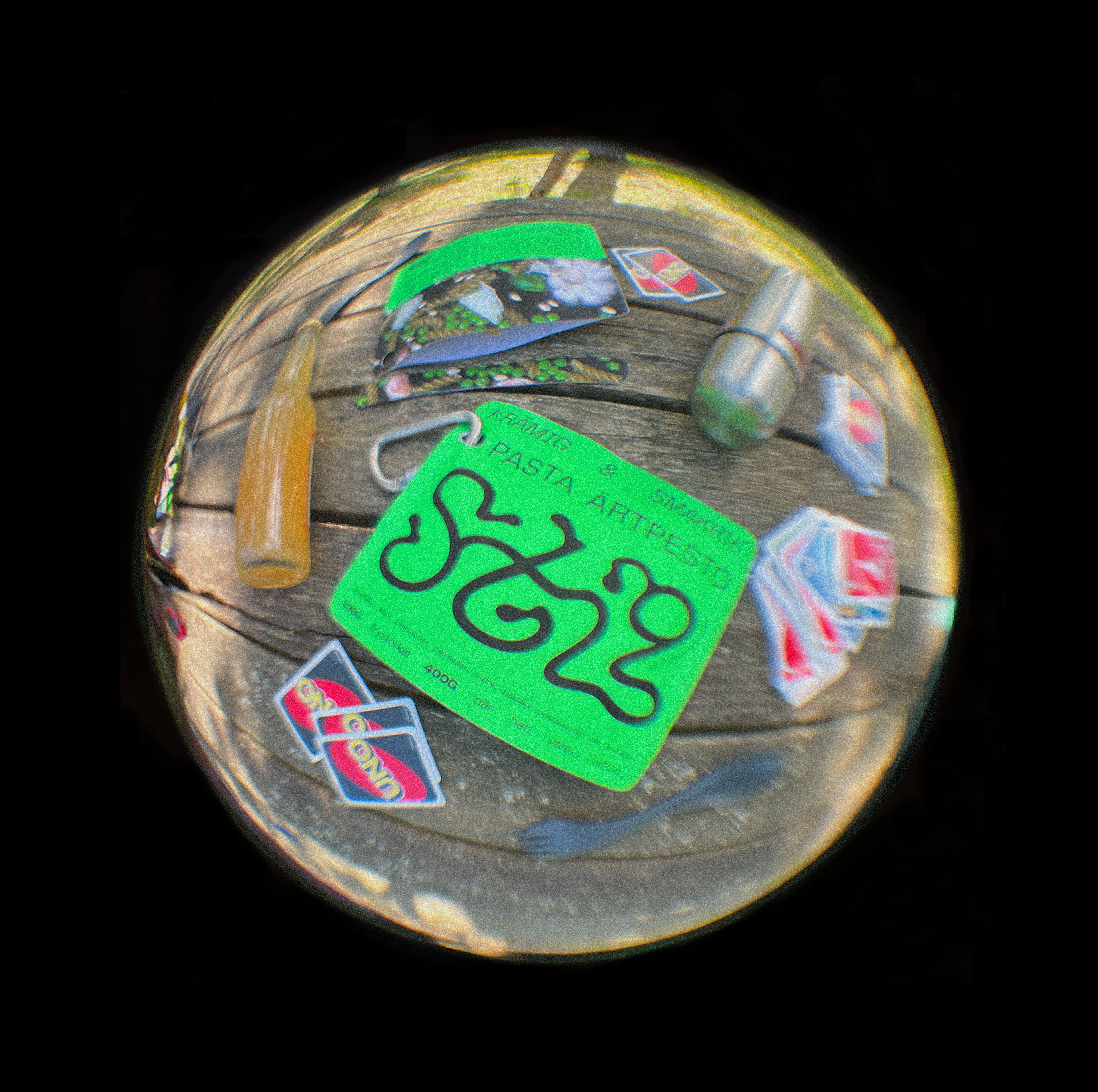
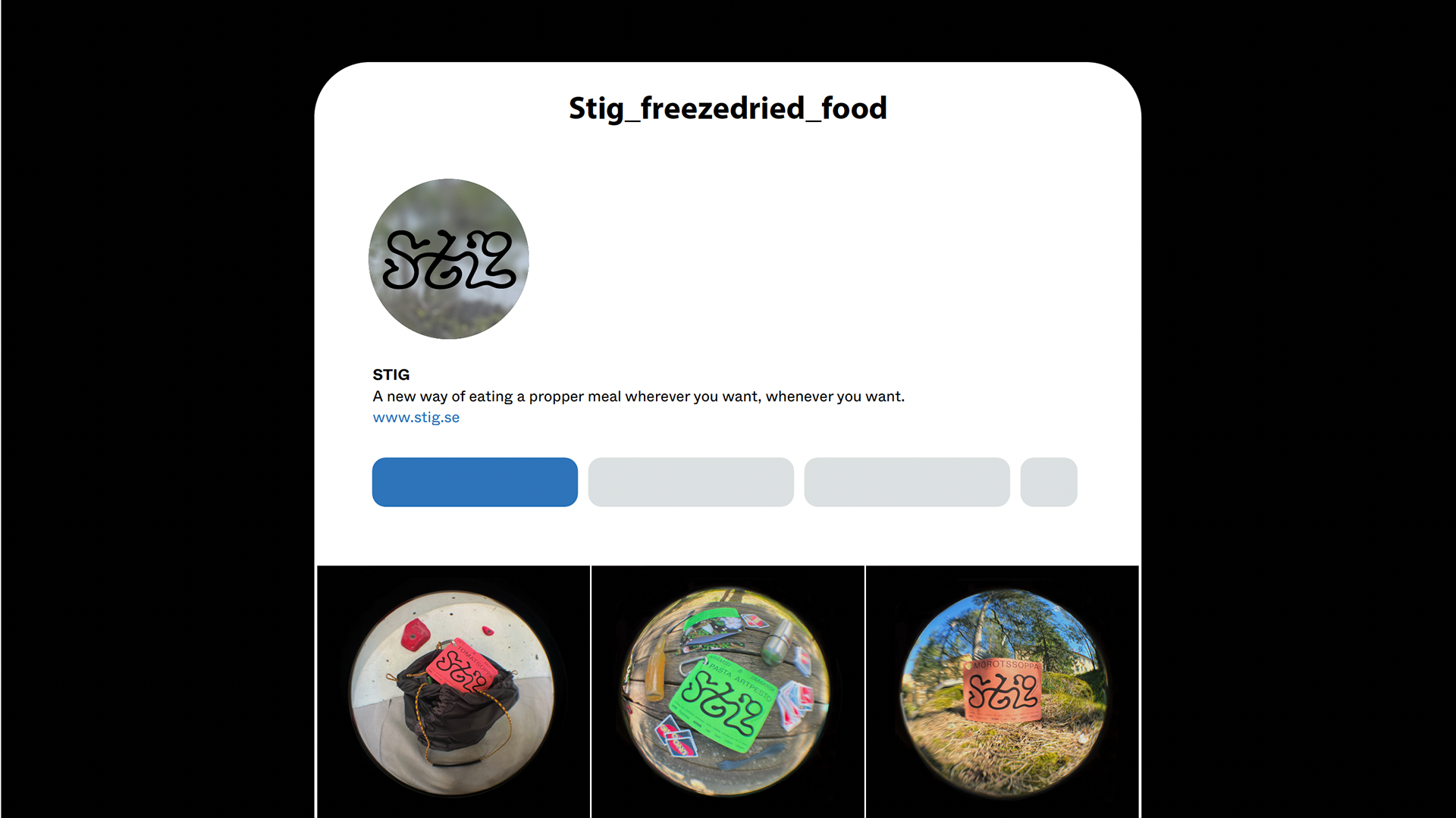
Stig means "path" in Swedish and comes from the old Norse word stíga, meaning to walk or hike. The name reflects the spirit of this branding and packaging concept: design made for the outdoors.
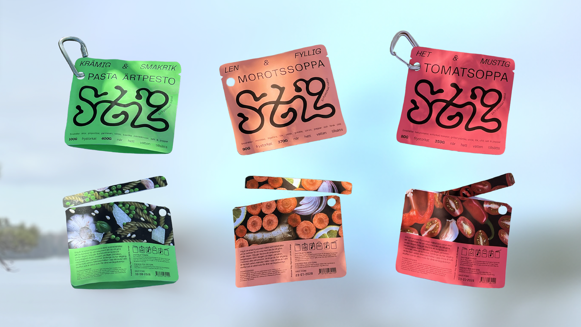
There’s a growing overlap between design-conscious consumers and outdoor enthusiasts. Stig aims to bring a fresh, playful look to freeze-dried food, making it more appealing to a younger, more selective audience. The bold colors clearly signal the flavor, and the package is designed to stand out on the shelf, unlike traditional competitors.
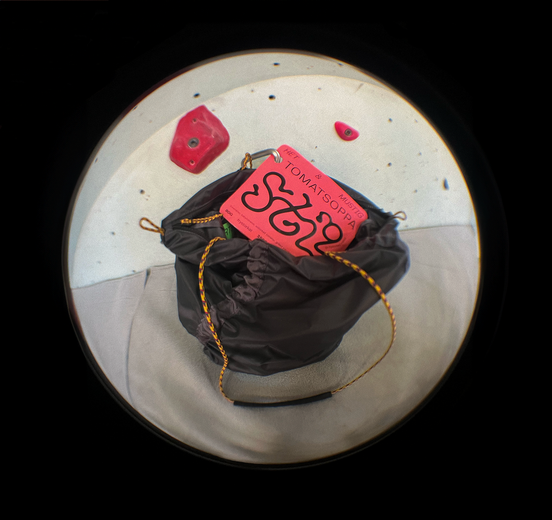
A smart detail is the hole on the side, which lets you attach the bag to your backpack with a carabiner. Once emptied, the resealable ziplock makes it reusable as a small trash bag—ideal for leaving no trace.
Currently sold mostly in outdoor stores, freeze-dried meals have potential in regular grocery stores too. Like canned goods, they’re convenient to store at home for spontaneous trips or emergencies.
May 2024


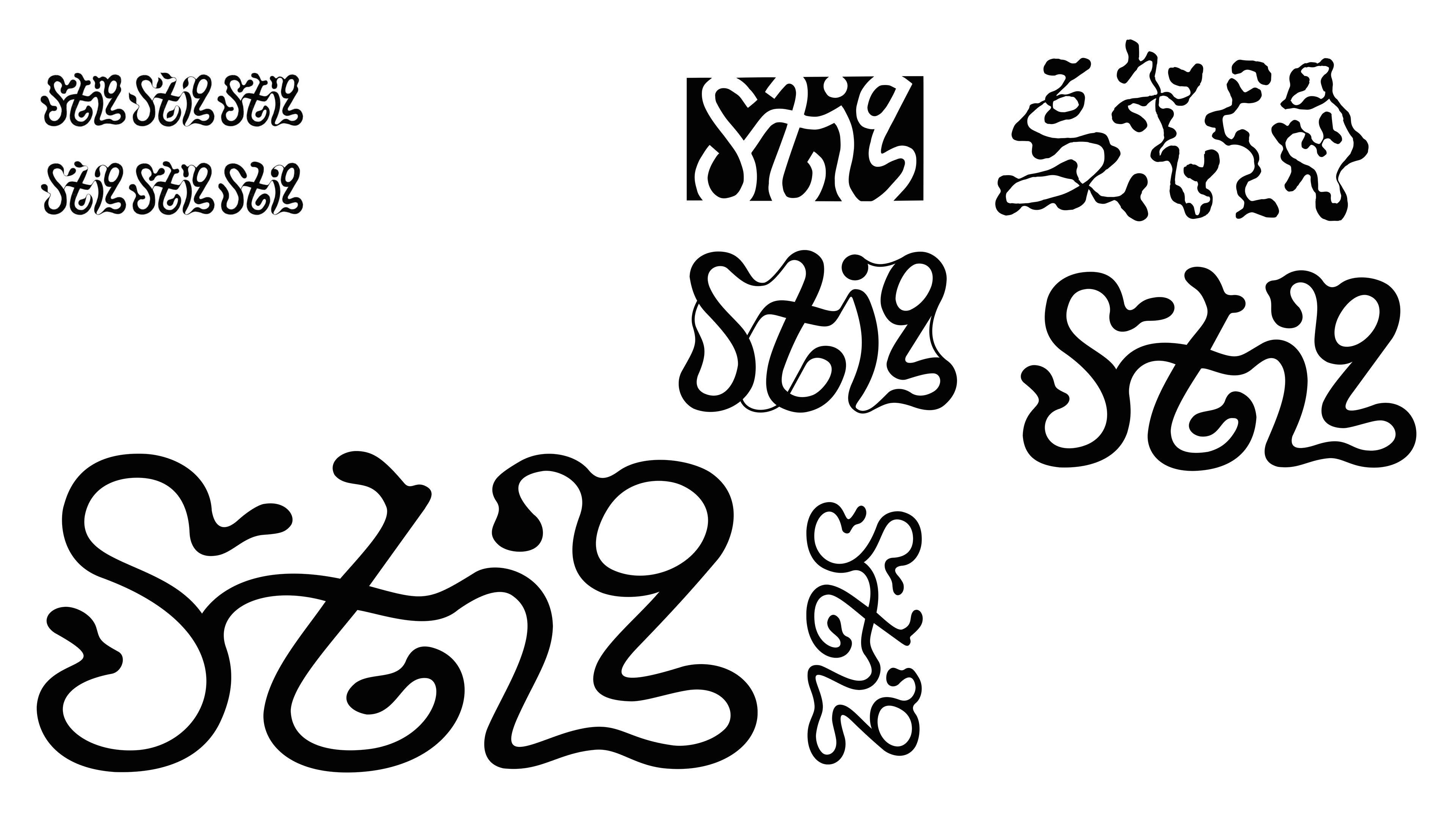
Some logo sketches from the process before deciding on the one down in the left corner. Can you find the hidden boot-shape in the negative space of the chose logotype?